Design System
This article demonstrates my expertise and strategic approach in balancing the immediate deliverables with the long-term vision of a structured design system that informs every touchpoint to create a cohesive brand experience.
Role:
Design System,
Visual Design,
UX, Strategy,
Marcomm & more
Team:
Shamer M
Joseph Pradeep Raj
Farzana Shahjahan
Tools:
Adobe Creative Suite
MS Office
Fragmented brand presence, inconsistent visual designs, diluted brand identity, substandard collaterals, and zero design system – were balanced by open-minded reporting managers and friendly colleagues.
The scenario at the company when I joined – Defiance Technologies.
Balancing Act
My perspective was promising, filled with an opportunity to establish a robust design system that transforms the brand and marks my presence at the organization.
Developing a design system was not an immediate or pressing requirement. Day-to-day priorities were individual collaterals that meet marketing needs.
Daily demands of marketing requirements were as overwhelming as the need for a grounding design system. But a design system was not my KPI.
Covert Integration.
Overt Results.
My strategy was to set up the process and start creating the design system at every touchpoint and collateral – without explicitly showcasing the design system.
I developed and applied in every ad-hoc collateral, ensuring the design adhered to standards and guidelines, creating a cohesive visual identity and enhancing the brand image.
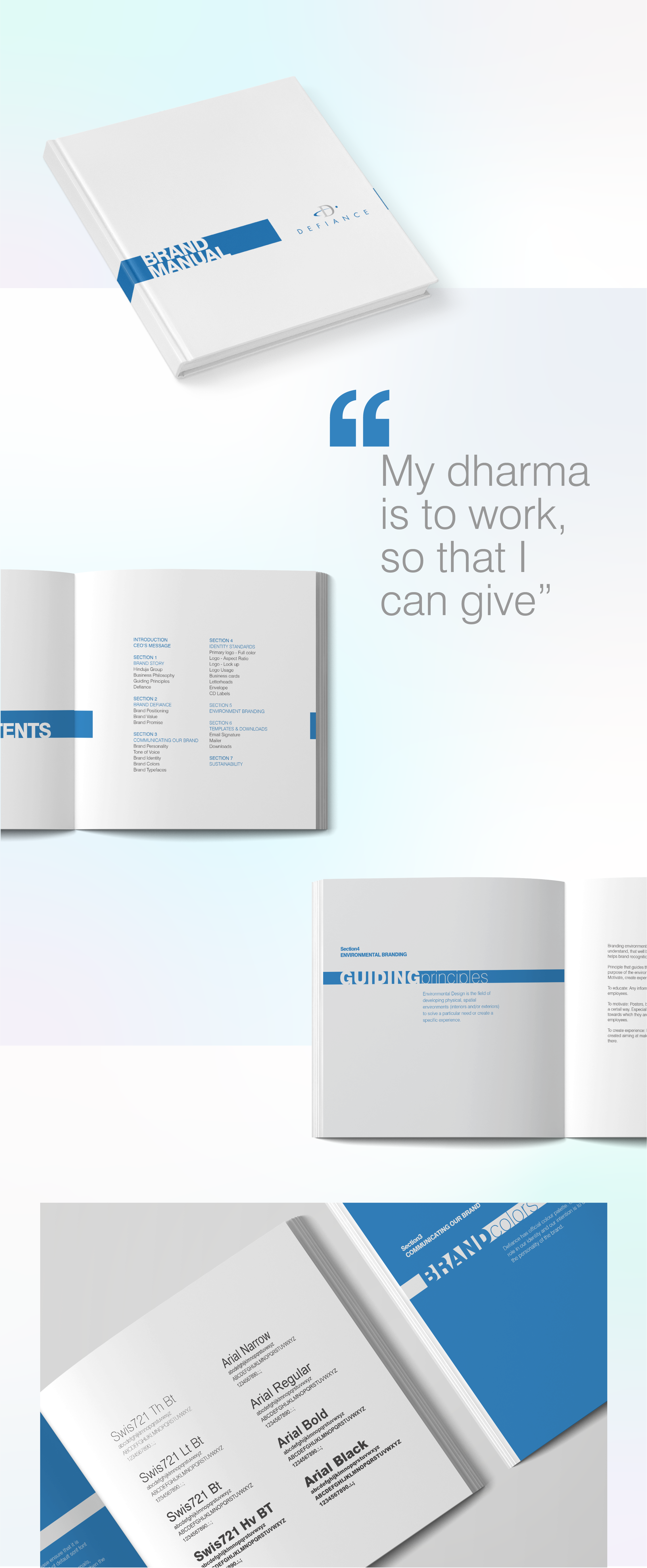
Defiance Technologies is a Hinduja Group Company, a leading provider of manufacturing, IT and ERP solutions known for its extensive expertise with a diverse portfolio of services and solutions.
A two-way transformative process.
Day-to-day marketing requirements and the implicit design system -worked together seamlessly in raising each others’ standards.
Day-to-day demands informed and influenced the development process of the design system – which eventually helped improve the design standards of the brand collaterals.
Incredible insights from the real-time deliverables and ad-hoc collaterals directly influenced the development process of the design system. Once implemented, a well-structured design system provided a solid foundation for creating future projects.
1.
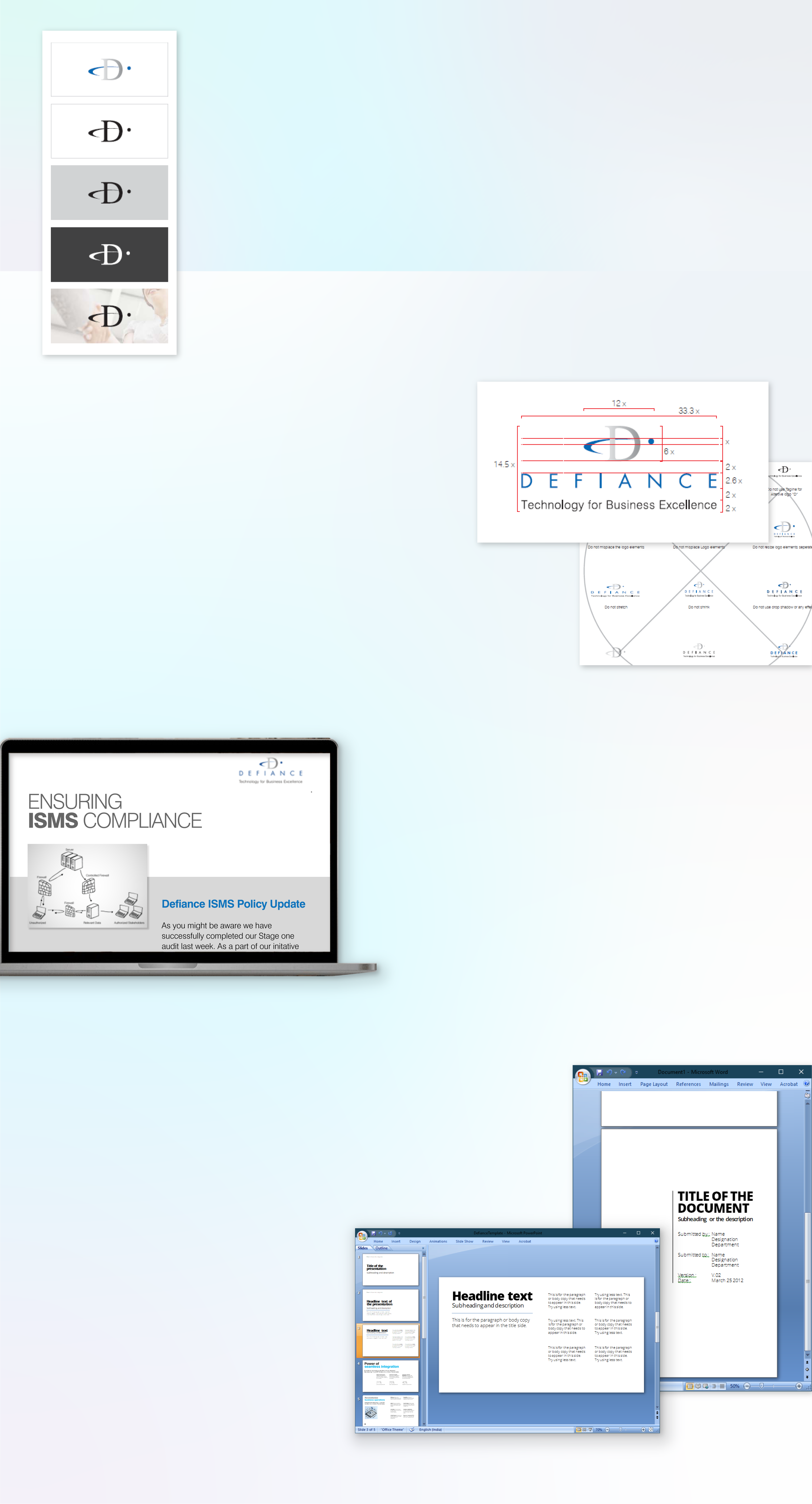
Created consistent brand identity
Standards and Guidelines:
Dos and Don’ts for the logo and tagline usage.
Template collections for documents, presentations and emailers.
2.
Gained higher participation.
Internal Communications:
Well-designed, engaging, easy-to-understand communications helped build employees’ trust, ensuring higher participation rates in company programs and initiatives.

3.
Made them feel recognized and valued
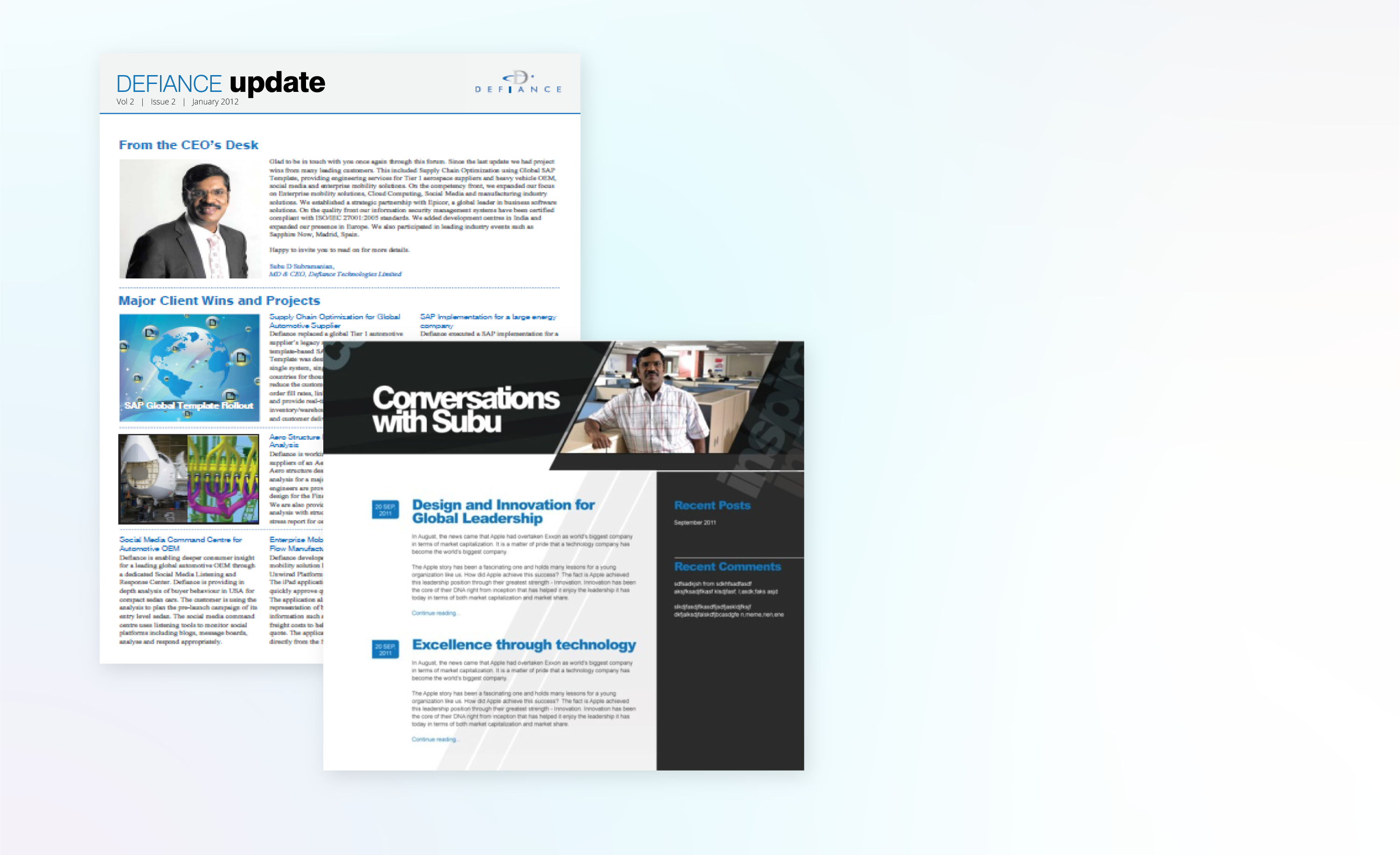
Newsletters and CEO Blog:
I created a sense of pride and a more connected network by featuring employee stories, company updates and initiatives.
A thoughtful structure of the CEO Blog encompassed the organization’s achievements, strategic goals, and department-wise achievements and acknowledged specific efforts to make employees feel valued.
4.
Better understanding. Higher conversions.
Product expaliners and direct mailers:
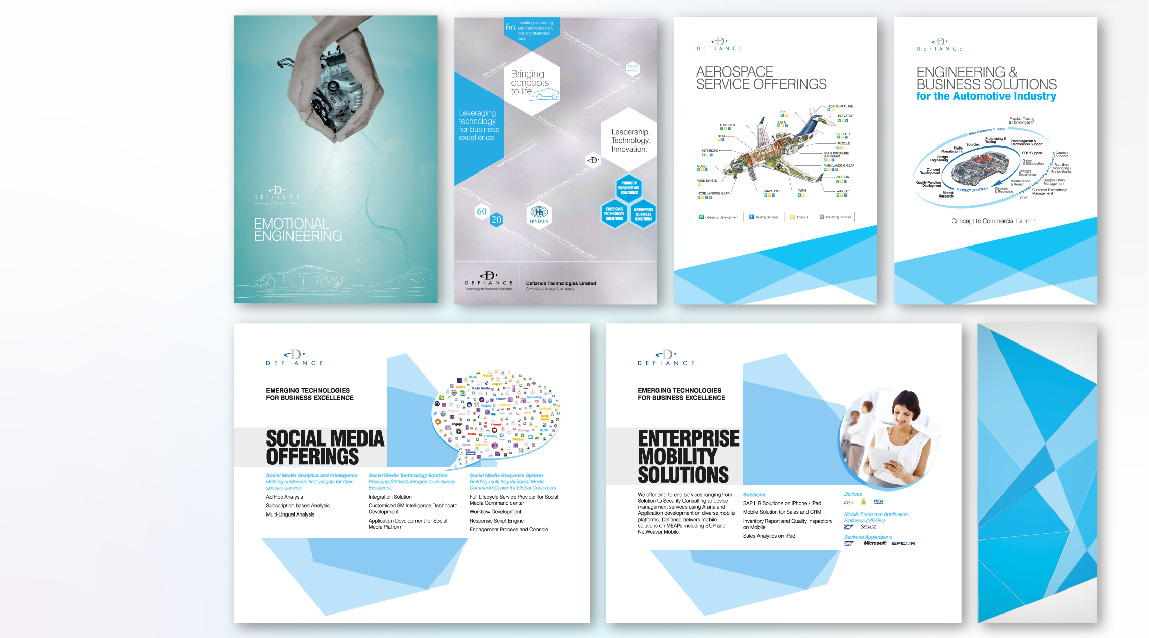
Setting new standards in product explainers that facilitate understanding and information retention to increase engagement and conversion rates. I created a consistent visual identity and clear messaging framework to ensure users feel informed and confident about the product’s capabilities.

5.
Smooth interaction. An enhanced user experience.
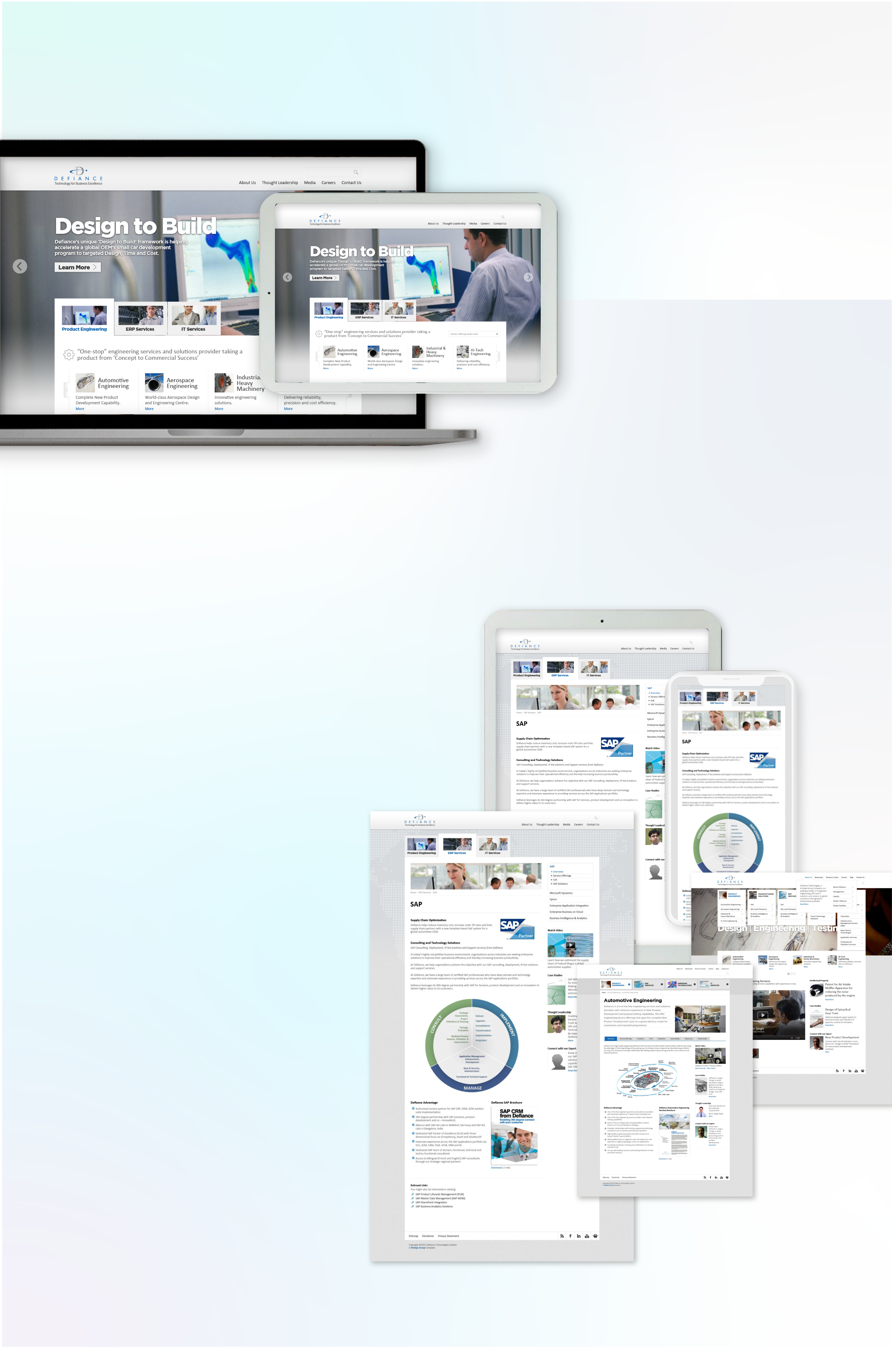
Corporate Website:
A well-structured content, clear navigation, concise messaging, and engaging visual elements backed by a robust design system improved brand perception, trust and credibility and enhanced user experience.
6.
Achieved a competitive edge.
Marketing Communications:
Built entire marketing communication collaterals with refined messaging and enhanced positioning, demonstrating product efficacy, highlighting unique differentiation and building overall competitive advantage.

7.
Created a sense of belonging.
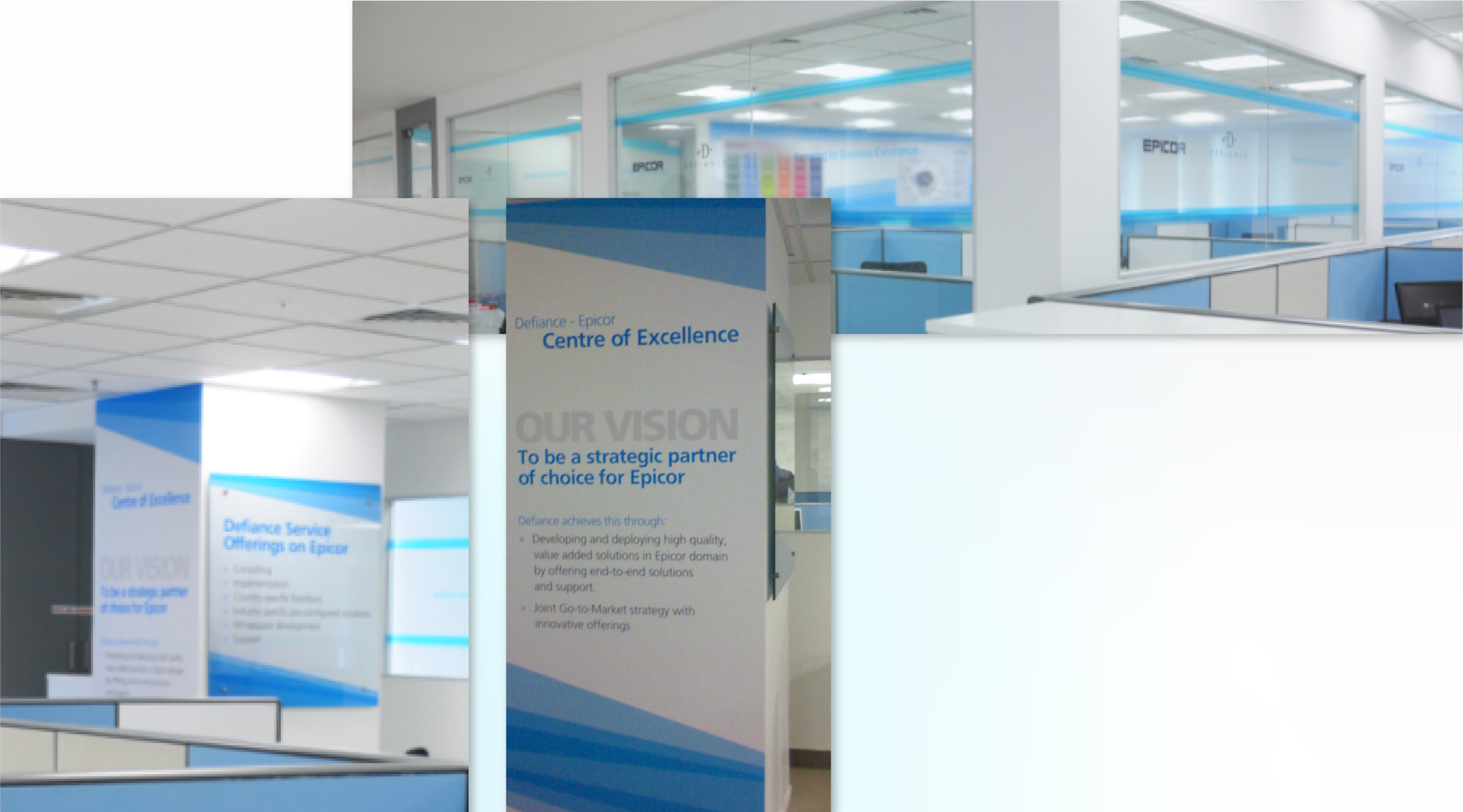
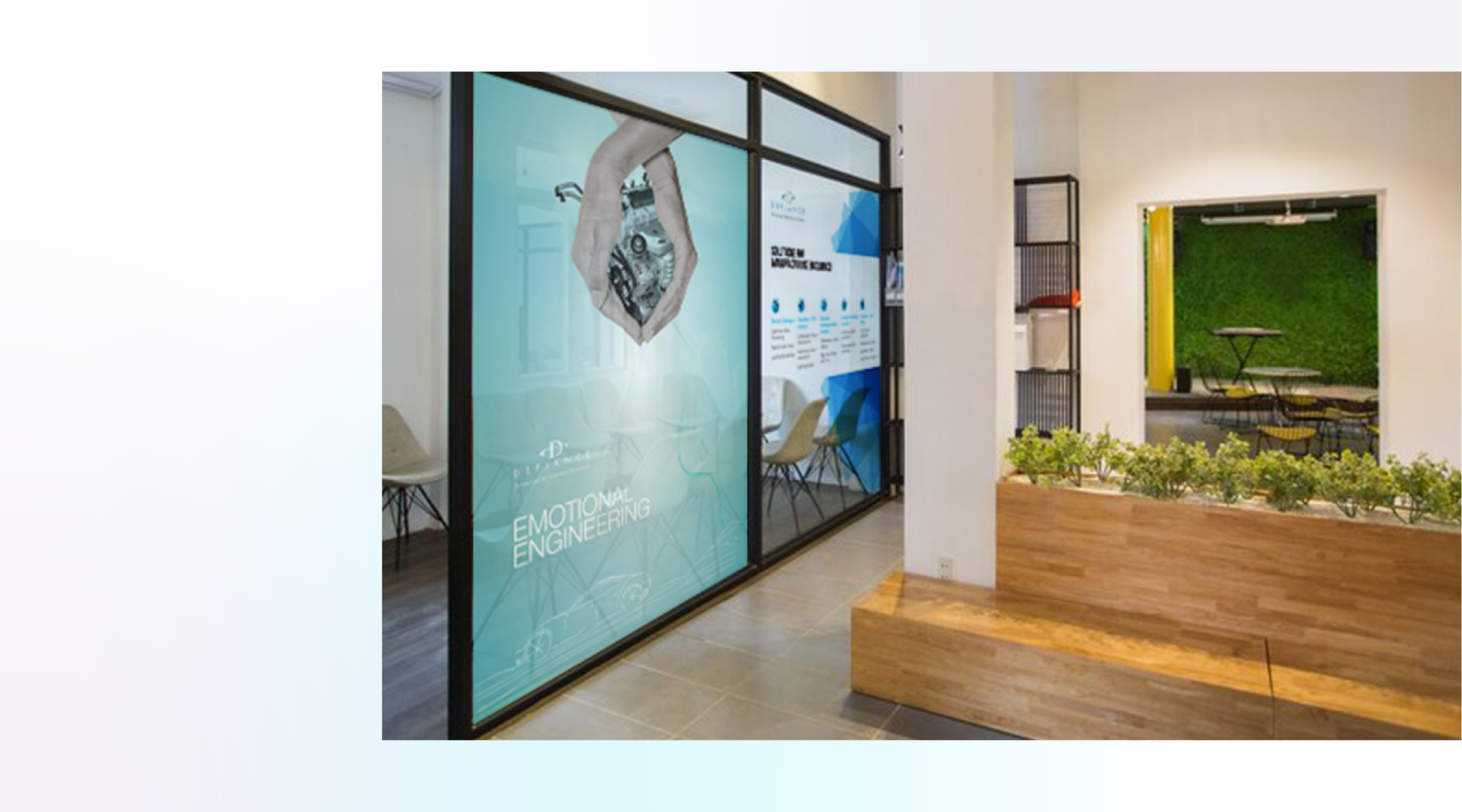
Office and CoE Branding:
Reinforced brand culture by utilizing spaces that remind employees of the brand’s mission and values. From the signages, directional signs, and collaborative spaces to common areas – consistent visual identity and brand image facilitated a sense of pride and belonging among employees and visitors..
8.
Built connections through a brand story.
Events and International Expos:
The design system influenced impactful and memorable brand interactions at events and international expos (Dubai and Germany). Consistent visual language and enhanced brand storytelling helped us strengthen brand appeal at the places where it mattered the most.
Unveiling the Hidden.
After two years of effort, another presentation project we were involved in directly with VC got us into a new project – The creation of the Brand Manual for Defiance Technologies – to me, it’s the time to put all the pieces together, refine and unveil the hidden system.
Hey,
Thanks for stopping by!
Connect with me.
and.farzana@gmail.com
It’s a beautiful day.
The sun is shining.
I feel good.
- A British Songwriter