Just a presentation? No!
A brief case study of a simple PowerPoint transformed into an in-depth project of enhanced brand positioning.
Role:
Content Design,
Visual Design,
User Experience,
Strategy
Team:
V Sumantran
Joseph Pradeep Raj
Farzana Shahjahan
Tools:
MS PowerPoint
Prezi
Adobe CC
Not the drill machine.
It’s a two-inch hole.
What started as a simple presentation requirement from the VC’s office transformed into an in-depth project that enhanced brand positioning.
Defiance Technologies is a Hinduja Group Company, a leading provider of manufacturing, IT and ERP solutions known for its extensive expertise with a diverse portfolio of services and solutions.
Dr V. Sumatran, Vice Chairman of the company, has an ambitious vision of presenting manufacturing, IT and ERP solutions into a single comprehensive offering that provides clients with a seamless end-to-end solution.

“An extensive and content and design-centric approach that involves the process of content design, user experience, and visual design to enhance brand positioning.”
“To develop an effective presentation that positions Defiance Technologies as a holistic end-to-end solution provider by consolidating its three solutions – Manufacturing, IT, and ERP under one unified offering.”
Getting even tougher:
The major challenge in the project involves explaining the need for an extensive makeover at the macro and micro level design approach and its processes to the stakeholders – leaders from different business units.
This challenge presented us with an opportunity for extensive stakeholder interviews. Understanding their spoken and implicit pain points in a unified offering helped us provide an intuitive solution with a comprehensive messaging framework which can serve even while presenting micro-level or unit/solution-wise offerings to achieve our goal – enhanced brand perception.
Key Focus:
Content design:
To restructure the content of the three solutions at a macro and micro level into a unified end-to-end offering.
Simplifying the complex messaging:
To develop the messaging framework to help stakeholders implement it at micro-level presentations.
Visual representation:
To create a unified visual identity system with consistent styles.
Strategy and approach
The design process involved constantly juggling between the bigger picture and slide-wise details, extensive content analysis, major content restructuring and development of a comprehensive information architecture, creating an easy-to-implement messaging framework, and developing a design system.
The design process also mandated comprehensive stakeholder interviews and training sessions.
Content Analysis
1
Reviewing existing presentations of each separate solution for core messages, common themes, value propositions and target audience
2
Evaluating the effectiveness of content delivery under separate solutions as well as for new positioning
3
To identify common themes, repetitions, gaps, inconsistencies, and complex messaging in the presentations of separate solutions.
4
To identify how the individual solutions complement each other
5
To identify and leveraging common themes like overlapping value propositions and benefits of each solution.

Content Design
1
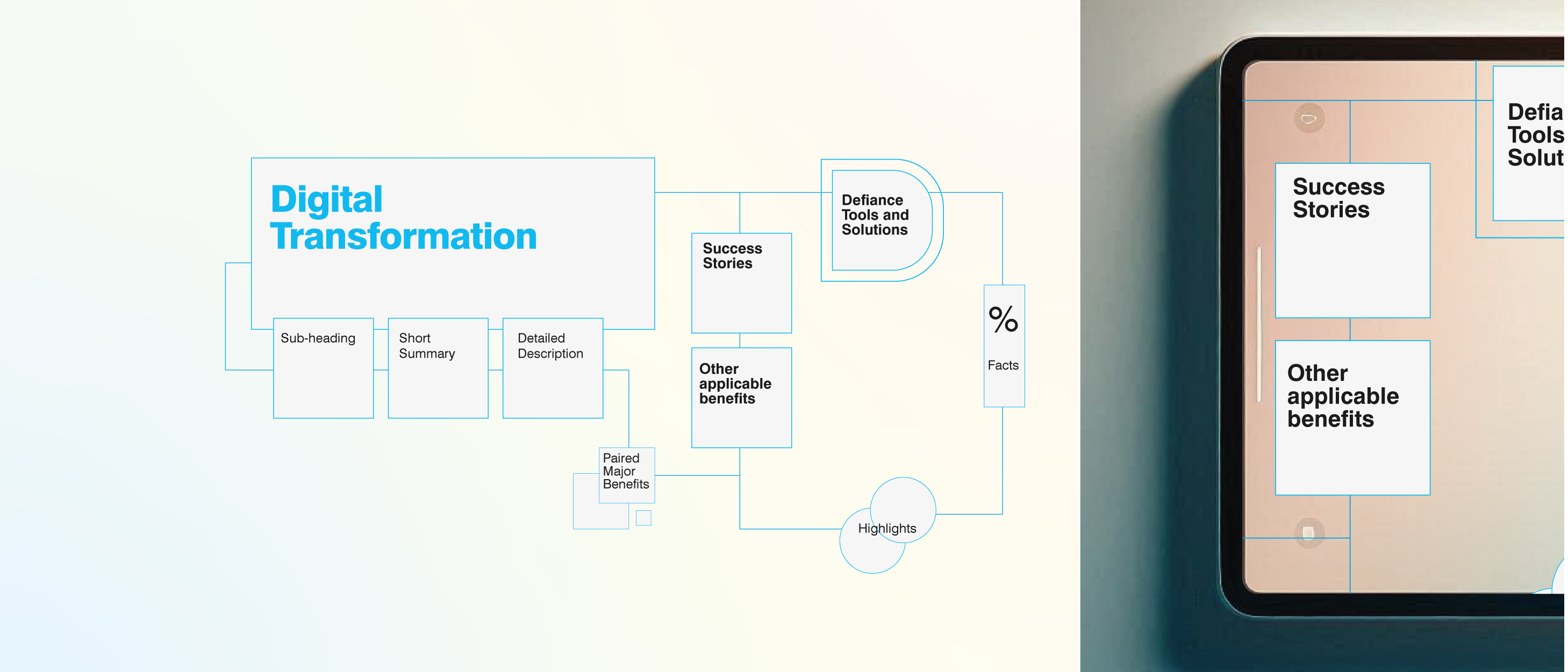
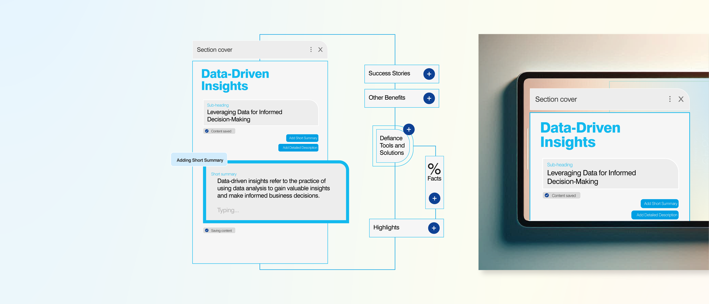
To develop an Information Architecture and restructure the entire content to facilitate content flow according to new positioning and identification of the minor solutions and services within the new content structure
2
To develop a storyline that outlines the key messages for each section
3
Content structure with a modular approach with a high-level overview followed by detailed content
Messaging Framework
1
To develop multiple comprehensive frameworks to educate and help stakeholders’ participation in content writing and effective messaging of the technical materials in the presentation
2
Messaging framework that outlines the core value proposition and key benefits of the solutions and services
3
The framework defines a hierarchy to prioritize the more impactful content based on solution and audience segment.
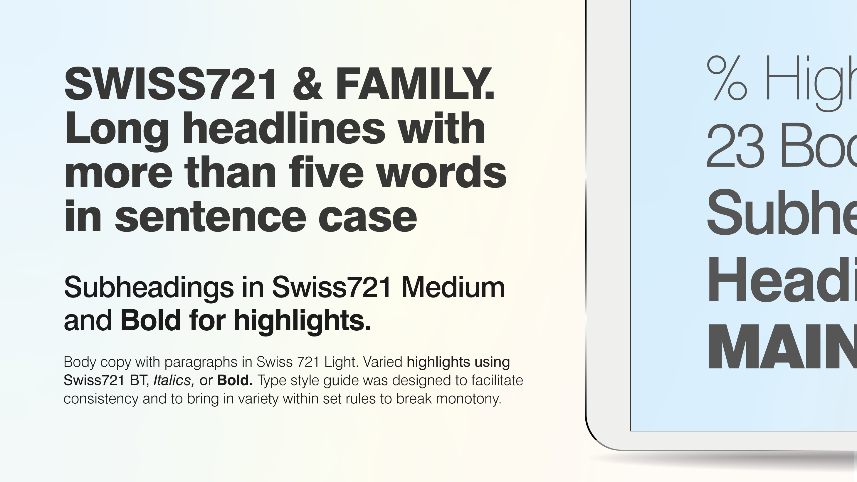
Visual Design
1
Consistent and unified brand image using style guides.
2
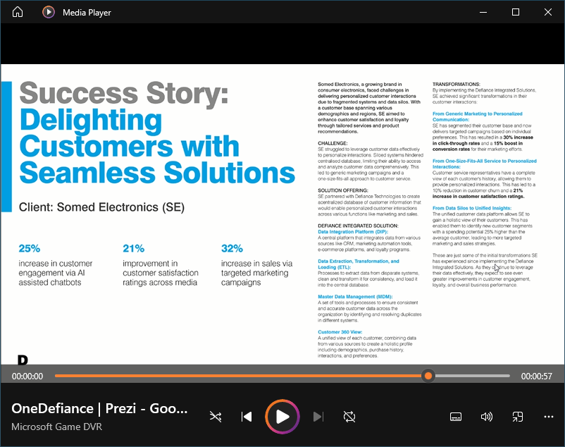
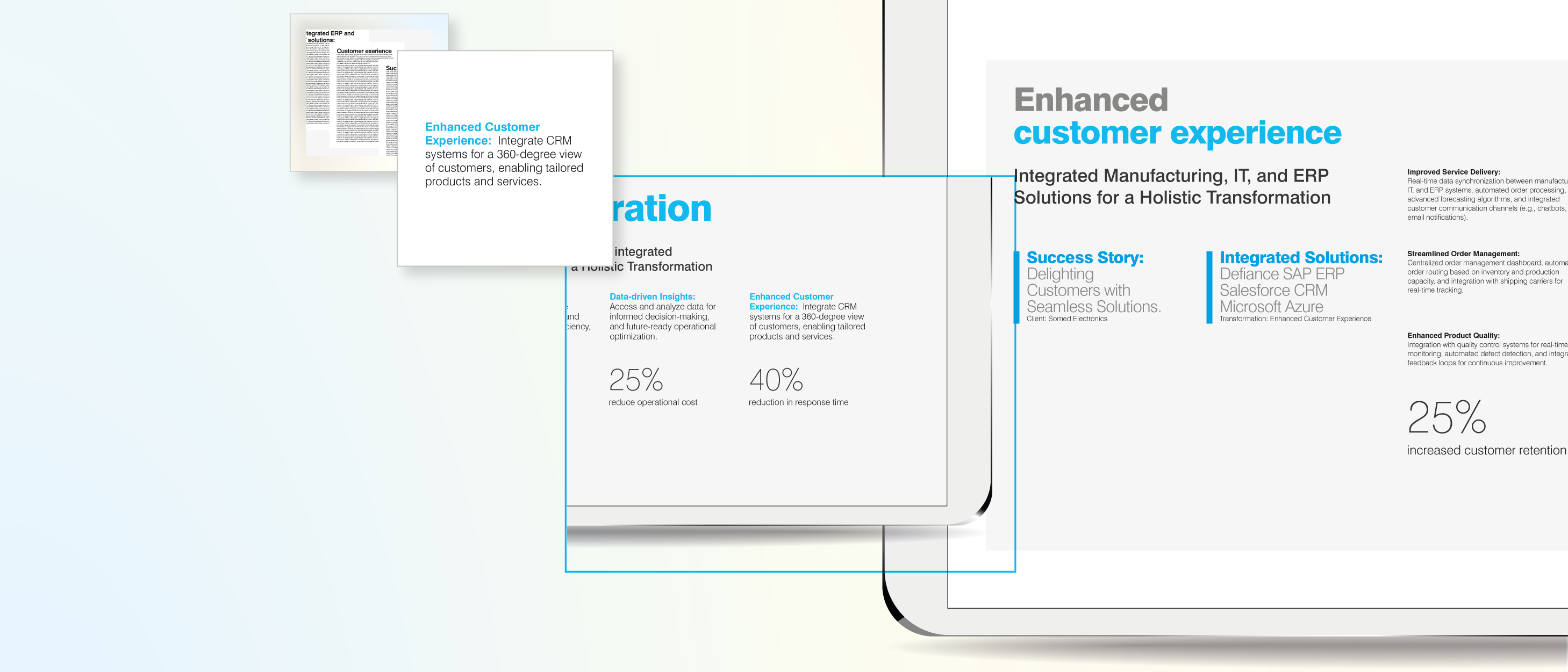
Storytelling techniques with real-time examples and testimonials
3
Making the presentation interactive using clickable tabs, slides and modular layouts
4
Reduce cognitive load by presenting complex data visually, using infographics, charts, and illustrations.
5
Leveraging Prezi, the tool well known for its zooming and other interactive features.
Did we achieve our goal?
The answer lies not in the presentation.
We didn’t only design the presentation but delivered the entire design system with storyline and messaging frameworks. We improved stakeholders’ commitment towards implementing the frameworks at the micro-level presentations.
Yes, We did!
We witnessed an increased enthusiasm among stakeholders in reviewing and using the new interactive presentation, which used to be a mundane routine with PPT and content-heavy slides.
The content and design-centric strategy helped the management understand the value of the design system in elevating the brand image and stakeholders’ engagement.
What happened then?
A small discussion with VC during the project presentation on the design system and its importance for brand image led to an intensive project on creating a Design System with extensive visual and identity standards and guidelines for Defiance Technologies.
Hey,
Thanks for stopping by!
Connect with me.
and.farzana@gmail.com
It’s a beautiful day.
The sun is shining.
I feel good.
- A British Songwriter